Design is more than aesthetics—it is a deliberate process of organizing visual components to communicate meaning. Whether you are working in graphic design, interior design, art, photography, or digital media, understanding the Elements of Design gives you a strong foundation for creating intentional and compelling work. These elements act as the building blocks that shape how a viewer absorbs and interprets a visual message.
In this comprehensive guide, we’ll break down the seven core components, explain how they function individually, and explore how they work together to form cohesive designs.
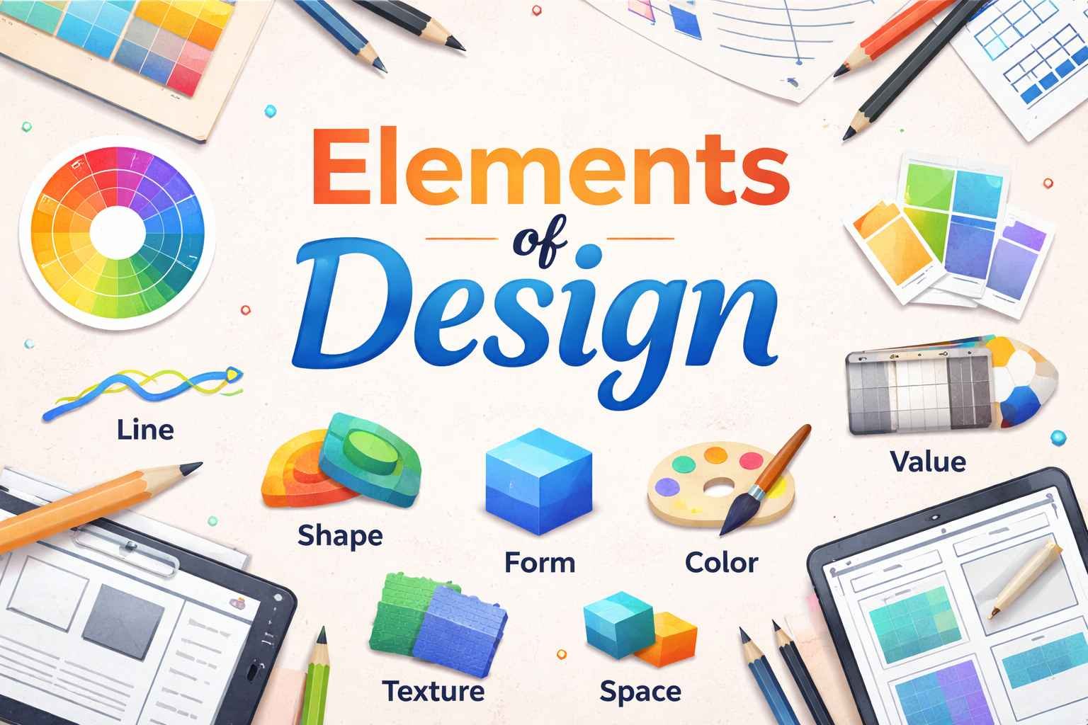
1. Understanding Line: The Foundation of All Visual Structure
A line is the most basic component in any visual composition. It guides the viewer’s eye, divides space, and can express mood or motion. Lines can be straight, curved, horizontal, vertical, or diagonal, and each type carries a specific visual impact.
- Horizontal lines create calmness and stability.
- Vertical lines suggest structure, strength, and height.
- Diagonal lines generate energy and movement.
- Curved lines add a sense of flow and softness.
Designers use lines to structure a layout, outline shapes, emphasize elements, or create visual direction. Mastery of line allows you to influence how a viewer navigates a design.
2. Shape: Forming the Building Blocks of Visual Identity
Shapes are created when lines connect or when areas are defined by color, texture, or values. Shapes can be geometric (circles, triangles, squares), organic (natural, free-form shapes), or abstract.
The strategic use of shapes can communicate personality and meaning:
- Geometric shapes convey order, stability, and precision.
- Organic shapes express natural movement and spontaneity.
- Abstract shapes evoke artistic or conceptual themes.
Understanding shape helps designers establish hierarchy, create symbolic meaning, and build memorable visual identities.
3. Form: Adding Depth and Dimension
Form refers to objects that have three-dimensional qualities such as volume, depth, and thickness. While shape is flat, form feels tangible.
Forms can be:
- Geometric (cubes, spheres, pyramids)
- Organic (natural, irregular objects)
Shading, perspective, and lighting techniques transform shapes into forms. In digital design, 3D modeling, gradients, and shadows help add depth. Form is essential in product design, architecture, sculpture, and realistic illustrations, contributing to a sense of realism and spatial awareness.
4. Space: Creating Balance, Emphasis, and Visual Flow
Space, often called “negative space” or “white space,” refers to the area around and between elements. It is a crucial yet often underestimated component.
Space serves multiple purposes:
- Improves readability
- Creates breathing room
- Directs focus
- Establishes visual hierarchy
Effective use of space prevents overcrowding and enhances clarity. Designers use positive space (the subject) and negative space (the background or open areas) to balance a composition. When used intentionally, space can highlight key content and enhance aesthetic harmony.
5. Texture: Adding Sensory Experience to Visuals
Texture refers to the feel or appearance of a surface. While digital designs cannot be physically touched, they can visually represent textures such as rough, smooth, glossy, or grainy surfaces.
Types of texture include:
- Tactile texture: Real physical surface qualities
- Visual texture: The illusion of texture through artistic techniques
Texture adds depth, character, and emotional resonance. It can make a design feel warm, rustic, elegant, or modern. Through patterns, photographs, or digital effects, texture provides richness that enhances visual storytelling.
6. Color: Influencing Emotion and Meaning
Color is one of the most powerful components within the Elements of Design because it directly impacts mood, perception, and brand identity. Designers rely on the color wheel, harmony rules, and psychological associations to craft effective palettes.
Key concepts include:
- Hue: The pure color (red, blue, green)
- Saturation: Intensity or purity of the color
- Value: Lightness or darkness of a color
Different colors evoke different emotional responses. For example:
- Blue conveys calmness and trust.
- Red suggests energy and passion.
- Green signifies growth and stability.
Color also influences visual hierarchy, helping certain elements stand out while allowing others to recede.
7. Value: Controlling Light, Darkness, and Contrast
Value refers to how light or dark an element appears. This affects depth, contrast, and visibility. Without value differences, designs appear flat and lack dimension.
Designers use value to:
- Create contrast between elements
- Establish focal points
- Add depth and realism
- Improve readability
Strong contrast can make elements pop and guide attention, while subtle value shifts provide sophistication and nuance. Value is especially crucial in monochrome designs, photography, shading, and illustration.
How the Elements Work Together in Real Design
Each component plays a unique role, but their true power appears when they are combined effectively. A strong design balances structure, visual interest, emotional tone, and clarity. Here’s how they interact:
- Line and shape form the foundation of layout and structure.
- Color and value enhance mood and emphasis.
- Texture and form add depth and realism.
- Space ties everything together, ensuring harmony and readability.
Understanding the Elements of Design allows creators to make intentional decisions, rather than relying on guesswork. Whether designing a poster, website, logo, product, or interior space, these principles ensure your visuals communicate effectively.
Practical Ways to Apply the Elements in Your Work
To use these elements more effectively, consider the following practical tips:
1. Start with a Clear Purpose
Every design should have a message. The elements you emphasize should support that message.
2. Establish a Visual Hierarchy
Use size, color, space, and value to highlight the most important content.
3. Experiment with Composition
Try different line directions, shapes, or spacing options until you find the most balanced structure.
4. Use Color Strategically
Consider emotional impact and brand alignment before choosing a palette.
5. Always Step Back and Review
Sometimes stepping away helps you see whether your elements work together cohesively.
Conclusion:
The Elements of Design form the foundation of visual communication. By understanding and applying them thoughtfully, you can create work that is not only visually appealing but also meaningful, balanced, and effective. Mastering these elements boosts creativity, improves aesthetic judgment, and empowers designers to produce compelling compositions in any field.
More Details : The Legacy and Craftsmanship Behind Catherine the Great’s Furniture
FAQs
1. What are the 7 Elements of Design?
The seven elements are line, shape, form, color, value, texture, and space.
2. Why are the Elements of Design important?
They provide a framework that helps designers create balanced and effective visual compositions.
3. How do color and value work together?
Color sets mood, while value controls brightness and contrast, helping elements stand out.
4. What is the difference between shape and form?
Shape is two-dimensional; form is three-dimensional and has depth.
5. How can I improve my design skills?
Study the elements, practice regularly, analyze professional designs, and experiment with different techniques.